TL;DR
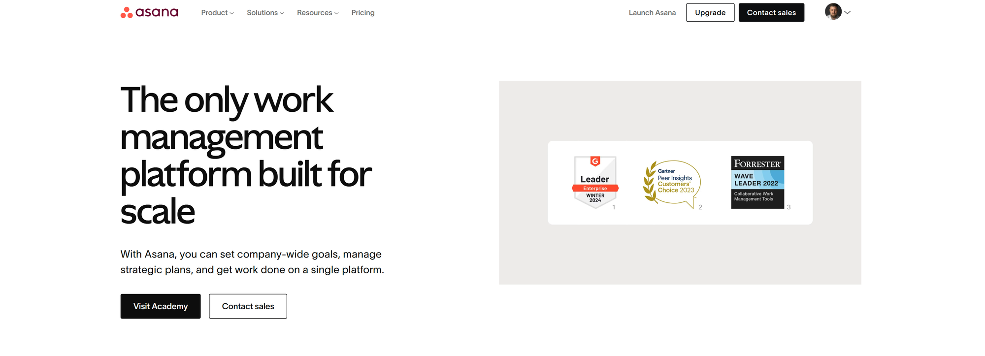
Your hero section determines whether visitors stay or leave within seconds. Research shows that users skim pages in an F-pattern, with 55% spending fewer than 15 seconds on a page. To maximize conversions, your hero section should:
- Have a clear, benefit-driven headline that instantly communicates your value.
- Reinforce why it matters with a strong subheadline or social proof.
- Use high-impact visuals that connect emotionally with your audience.
- Feature trust signals like reviews or star ratings.
- Include one clear call-to-action (CTA) above the fold.
- Experiment with dynamic content to personalize user experiences.
Now, let’s break down each element in more detail.
Your hero section is the first thing visitors see when they land on your website. In a matter of seconds, they will decide whether to stay and explore or bounce. Research from Nielsen Norman Group (NNG) and Microsoft Research shows that users typically scan web pages in an F-pattern, and 55% of visitors spend fewer than 15 seconds on a page (Chartbeat Analysis). That means your hero section must do the heavy lifting in a short window of time.
So, what makes a hero section effective? Let’s break it down based on conversion rate optimization (CRO) principles and real-world data.
1. Clear, Benefit-Driven Headline
80% of users read the headline but never scroll further (NNG Study). If your headline doesn’t immediately communicate what your website does and why it matters, you risk losing potential customers. A strong headline should:
- Be clear and specific about what you offer.
- Focus on customer benefits rather than product features.
- Avoid vague or clever wording that requires extra effort to understand.
Example: Instead of “Premium Outdoor Gear”, try “The Last Jacket You’ll Ever Need – Built for Adventure, Tested by Experts.”
2. Answer the Question: “Why Should I Care?”
A compelling subheadline or supporting copy should reinforce why your offer is relevant and valuable. Users make decisions based on outcomes, not features, so this section should:
- Expand on the problem you solve or the value you provide.
- Use social proof or credibility indicators where possible.
- Be concise—this isn’t the place for long explanations.
Example: “Trusted by 50,000+ adventurers. 97% say it’s the best gear they’ve ever owned.”

3. Use High-Impact Visuals
Users process images 60,000 times faster than text, and A/B tests consistently show that lifestyle imagery outperforms isolated product shots by 12–18% in engagement. The right visuals should:
- Show your product in real-life use cases.
- Feature people interacting with the product for a more relatable experience.
- Avoid clutter or distracting background elements that take away from the main message.
4. Social Proof Above the Fold
Trust is everything in eCommerce. Studies show that including reviews or trust signals in the first fold can increase conversions by 14–20%. To build credibility, you can:
- Display star ratings and testimonial snippets prominently.
- Mention how many customers have purchased or rated your product.
- Use real customer UGC (user-generated content) rather than generic stock images.
5. One Clear Call-to-Action (CTA)
A cluttered hero section with multiple CTAs can lead to decision paralysis. Research suggests that a single, well-placed CTA can increase click-through rates by 9–11%. Your CTA should:
- Use action-oriented language (e.g., “Shop Now” instead of “Learn More”).
- Stand out visually with a contrasting color.
- Be positioned above the fold, ensuring users don’t have to scroll to find it.
6. Dynamic Content for Personalization
If your audience varies widely, testing dynamic content—such as personalized headlines or segmented hero sections—can boost relevance and engagement. Randomizing reviews and visuals ensures that returning visitors don’t always see the same content in the same position, creating a fresh experience.
Dos and Don'ts for an Effective Hero Section
| Dos | Don'ts |
|---|---|
| Use a clear, benefit-driven headline | Use vague or overly clever wording |
| Keep the primary CTA above the fold | Overload with multiple CTAs |
| Feature high-quality lifestyle images | Use generic stock images |
| Include social proof (reviews, ratings) | Leave out trust signals |
| A/B test different elements regularly | Assume the first version is perfect |
| Keep the design clean and uncluttered | Overload with too much text or visuals |

Key Takeaways
A high-converting hero section must be clear, relevant, visually engaging, and focused on a single action. By leveraging real CRO insights and behavioral studies, you can create a hero section that holds attention, builds trust, and ultimately drives more conversions.
If you’re looking to improve your hero section, consider A/B testing different elements to see what resonates most with your audience. Small tweaks—such as refining your headline, updating visuals, or adjusting your CTA placement—can lead to significant conversion lifts over time.
Frequently Asked Questions (FAQ)
Q: How long should my headline be?
A: Ideally, keep it under 10 words while clearly communicating what your product/service does. Shorter, punchy headlines tend to perform better.
Q: Should I use video in my hero section?
A: It depends on your audience. If your product benefits from a quick demonstration, autoplaying muted videos can improve engagement. However, static images often load faster and convert better.
Q: Can I use multiple CTAs in the hero section?
A: You can, but it’s best to have one primary CTA. Too many choices can confuse users and lead to fewer conversions.
Q: How often should I A/B test my hero section?
A: Test new variations every 4–6 weeks to see what resonates best with your audience. Prioritize big-impact changes like headlines, imagery, and CTA placement.
If you have any other questions, feel free to ask!


Discussion